4,491 search results
(0.01 seconds)
- Steel by Cerri Antonio,
$35.00 STEEL regular, outline and bold, is a 3-font system that can be layered in different ways to create infinite title effects used commonly in poster and 3D logo design. Steel’s layer combinations give you complete control in producing styles like outline, 3D, and beveled. It can be used alone and/or in layers, and allows you adjust leading and kerning. Each font has similar metrics, so when your title is set, copy and paste-in-place to create layers of different weights/styles to build out your desired effect. Steel works great in any graphics application that allows you to utilize layers or 3D effects.
 - Steed by Device,
$29.00 A condensed and bold obround sans inspired by 60s condensed inserat faces, with a more pronounced thick/thin stress as seen on the titles of the Avengers TV show.
 - Steel Leg by Gatype,
$9.00 Steel leg is a font that was scratched with a brush pen, to get a natural texture, this font will show the characteristics of the hand.This font is perfect for various places such as clothing, posters, title books, stationery designs, quotes, branding, logos, invitations, greeting cards, t-shirts, packaging designs and more.
 - FF Steel by FontFont,
$41.99 - Steel Race by Artyway,
$14.00 Powerful design of the Steel Race font will speed up your pulse! Wide with sharp serifs and a verified angle of inclination radiate confidence and respect. The "Steel" will save your time and nerves when creating the dynamic compositions, like sports events and promotions or logos. Make sure yourself.
 - RB Steel by RockBee,
$28.00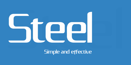
- Steel Grrrder by ULGA Type,
$9.00 Steel Grrrder is a robust, industrial-style stencil typeface family consisting of six weights, from light to black, with corresponding italics. Suitable for all kinds of display purposes including posters, film titles, book covers, magazines, advertising, logos, packaging, signage and games design, Steel Grrrder is especially useful where the message needs some serious geometric bite behind it. Steel Grrrder is best categorised as a constructivist sans family. The character shapes are sharp, angular and slightly condensed - it’s a rigid, no-frills, no-curves, mega-metallic design. Legible? Not really. Readable? I think not. In your faceable? Absolutely! This is a tough display typeface, designed to work in the most demanding typographic situations. It won’t buckle under pressure or wilt when the heat’s turned up. Forged from carbon steel and wrapped in a layer of Graphene, Steel Grrrder is unashamedly rugged, a rock-hard pound-for-pound boxer specialising in thumping knockouts. The Steel Grrrrder extended family also includes a six-weight joining script and two display fonts, Groove & Nutjob - all designed to work with each other.
 - Luxgard Steel by Tadiar,
$23.00 Luxgard Steel is an unique vintage color gradient vector SVG font created for such areas as Media & Entertainment, Food & Drinks, Clothes, Music, Games & Applications, etc. with Multilingual support. Well use in vintage labels, headers & titles, Posters, Street Signs and other Outdoor, Package Design. Luxgard Steel is derivative from Luxgard Layered font (it is also cool and flexible): https://www.myfonts.com/collections/luxgard-font-tadiar
 - Times by Linotype,
$40.99In 1931, The Times of London commissioned a new text type design from Stanley Morison and the Monotype Corporation, after Morison had written an article criticizing The Times for being badly printed and typographically behind the times. The new design was supervised by Stanley Morison and drawn by Victor Lardent, an artist from the advertising department of The Times. Morison used an older typeface, Plantin, as the basis for his design, but made revisions for legibility and economy of space (always important concerns for newspapers). As the old type used by the newspaper had been called Times Old Roman," Morison's revision became "Times New Roman." The Times of London debuted the new typeface in October 1932, and after one year the design was released for commercial sale. The Linotype version, called simply "Times," was optimized for line-casting technology, though the differences in the basic design are subtle. The typeface was very successful for the Times of London, which used a higher grade of newsprint than most newspapers. The better, whiter paper enhanced the new typeface's high degree of contrast and sharp serifs, and created a sparkling, modern look. In 1972, Walter Tracy designed Times Europa for The Times of London. This was a sturdier version, and it was needed to hold up to the newest demands of newspaper printing: faster presses and cheaper paper. In the United States, the Times font family has enjoyed popularity as a magazine and book type since the 1940s. Times continues to be very popular around the world because of its versatility and readability. And because it is a standard font on most computers and digital printers, it has become universally familiar as the office workhorse. Times™, Times™ Europa, and Times New Roman™ are sure bets for proposals, annual reports, office correspondence, magazines, and newspapers. Linotype offers many versions of this font: Times™ is the universal version of Times, used formerly as the matrices for the Linotype hot metal line-casting machines. The basic four weights of roman, italic, bold and bold italic are standard fonts on most printers. There are also small caps, Old style Figures, phonetic characters, and Central European characters. Times™ Ten is the version specially designed for smaller text (12 point and below); its characters are wider and the hairlines are a little stronger. Times Ten has many weights for Latin typography, as well as several weights for Central European, Cyrillic, and Greek typesetting. Times™ Eighteen is the headline version, ideal for point sizes of 18 and larger. The characters are subtly condensed and the hairlines are finer. Times™ Europa is the Walter Tracy re-design of 1972, its sturdier characters and open counterspaces maintain readability in rougher printing conditions. Times New Roman™ is the historic font version first drawn by Victor Lardent and Stanley Morison for the Monotype hot metal caster." - YT Steel Latin by Yangtype,
$9.00 The concept of this letter is a tall, well-dressed man with moderate muscles, decent appearance, and manners. We are always impatient. I miss someone who can give me some space. This letter gives you some leeway that you can rely on for a moment.
 - Steel Grrrder Nutjob by ULGA Type,
$9.00 A single-weight display font, Steel Grrrder Nutjob is an industrial-style stencil with a nut device. It’s best used in short display settings or as an introductory drop cap to grab attention. The capital letters sport an open nut while the lowercase letters feature a solid nut. It’s not the most legible design, but if you’re after a robust display font with an element of nuts, this will do the job perfectly. The Steel Grrrrder extended family also includes a six-weight sans-serif with corresponding italics, a six-weight joining script and a display font, Groove - all designed to work with each other.
 - FF Manga Steel by FontFont,
$41.99Dutch type designer Donald Beekman created this display FontFont in 2001. The family has 8 weights, (including italics) and is ideally suited for logo, branding and creative industries, music and nightlife as well as poster and billboards. FF Manga provides advanced typographical support with features such as ligatures. It comes with proportional lining figures. - Steel Grrrder Groove by ULGA Type,
$9.00 A single-weight display font, Steel Grrrder Groove is a constructivist inline stencil design best used in short display settings or as an introductory drop cap to grab attention. The design is sharp, angular and slightly condensed with a striking inline groove giving it an air of chiselled chunkiness. It’s groovy but in a slightly robotic way.
 - Steel Grrrder Script by ULGA Type,
$9.00 Steel Grrrder is an industrial-style joining script with a stencil effect, available in six weights ranging from Light to Black. Great for all kinds of display purposes including posters, film titles, book covers, magazines, advertising, signage, packaging, logos and tanks, this is a script with a sharp personality and a steely presence. However, if you’re searching for a “nice” script - sorry, bud - you’re looking in the wrong place. Steel Grrrder Script doesn’t entice the reader with voluptuous curves, flowing swashes or frisky letterforms, instead its sharp chiselled features compel the reader to pay attention. Characters muscle their way along like robotic bulldogs in steel-toe cap boots. Steel Grrrder Script is a veritable slab fest, best categorised as a constructivist joining script. Forged from carbon steel and wrapped in a layer of Graphene, this is a robust display typeface family able to withstand even the most demanding typographical situations. The Steel Grrrrder extended family also includes a six-weight sans-serif with corresponding italics and two display fonts, Groove & Nutjob - all designed to work with each other.
 - Dark Blades Steel by Tadiar,
$19.00 !!! Please note that the font works in Photoshop CC2017 and higher and in Illustrator CC 2018 and higher only. !!! DarkBlades Steel is an unique vintage color gradient vector SVG font you may use in your projects just typing a text in Illustrator or Photoshop. DarkBlades Steel is derivative from DarkBlades Font Family: https://www.myfonts.com/collections/dark-blades-font-tadiar Designed for: - Vintage branding (Clothes, Alcohol, Bikes, Games) - Horror - Music branding - Myth: Vampires, Zombie, Halloween, Werevolves, Magic, Fantasy - Medieval style Well use in vintage labels, headers & titles, Posters, Street Signs and other Outdoor, Package Design.
 - Steel Stencil JNL by Jeff Levine,
$29.00 A group of unique metal plates with stencil initials cut into them was spotted while browsing through online auctions for source material. What made these items even more interesting was how some of the stencil letters had been sectionally divided - not vertically or horizontally as in most stencils, but lines cut at angles. This is the basis for Steel Stencil JNL and Steel Stencil Oblique JNL.
 - Stealing Hearts by Nathatype,
$29.00 Looking for a beautiful font to captivate your audience, clients, or party guests? If you need to create invitations, have a t-shirt branding company, or whatever it is - then this is the perfect font for you. Stealing Hearts-A Handwritten Script Font Stealing Hearts is a elegant script typeface. Designed primarily as a captivating handcrafted with style. Every swash, stroke, and curve was created to entice happiness and elegance. Ideal to create amazing headings, invitations, logos, and social media graphics. Our font always includes Multilingual Support to make your branding reach a global audience. Features: Ligatures Stylistic Sets PUA Encoded Numerals and Punctuation Thank you for downloading premium fonts from Nathatype
 - Sterling Script by Canada Type,
$54.95 Sterling Script was initially meant to a be digitization/reinterpretation of a copperplate script widely used during what effectively became the last decade of metal type: Stephenson Blake's Youthline, from 1952. The years from 1945 to 1960 saw a heightened demand for copperplate faces, due to post-war market optimism, as well as the banking and insurance industries booming like never before, which triggered the need for design elements that express formal elegance and luxury. The name Sterling Script is a tip of our hat to England, the Stephenson Blake foundry's country of origin. It is also a historical hint about copperplate scripts having been used mainly for banking and bonds in the 19th century. Originally we just wanted to resurrect a gorgeous metal type from the ashes of forgotten history. But after the main font was done we saw that the original s really needed an alternate. We made one. But we felt sorry for the original s and didn't want to see it dropped from use altogether, so we saved it by building a set of ligatures that solve the minor connection problem with the s at large sizes. Before the completion of the ligatures, a few different alternates were also drawn, and we were faced by the fact that the single font we set out to do was now a much larger set than we anticipated. While thinking about how to split up our unexpected bundle of large characters, we drew a few more alternates and some swashes. This abundance "problem" reached a certain point where there was no looking back, so we just decided to go all the way with this font. We added many more alternates, swashes, ligatures, and two full sets of each beginning and ending lowercase letter. The result is over 750 characters of sheer elegance. Sterling Script has many features that set it above and beyond other copperplate scripts: - It has 2 beginning and 2 ending alternates for every single lowercase character. The beginning and ending variants on the vowels are also available in accented form in the appropriate cells of the character map. - Sterling Script is the ultimate elegant font choice for luxury design. Very elegant, but not too soft. Its strong and confident shapes convey a message that is real, comforting and assuring. - One of the eventual purposes of expanding Sterling Script this extensively was to create a script that finds the middle ground between formal and informal without compromising either trait, a script where the degree of formality can be gauged, tweaked, cranked up or toned down depending on the layout's needs. Aside from beginnings and endings, there are multiple variations for the majority of the basic characters. This is a formal script on steroids, where twirls and swashes can be set to come out unexpectedly from any place in the word, which is great for reducing the inherent rigidity of words set in copperplate scripts and "humanizing" them whenever needed. This is especially useful for wedding, postcard and invitation design, where not every viewer of the collateral material has something to do with banking or insurance. - With such an extensive character set, a designer can easily set a word or a sentence in 10 or more different ways, and choose the perfect one for the task at hand. This is particularly useful for work where details are of utmost importance, like logos, slogans, or elegant engravings that consist of one to three words. Let those swashes and twirls intertwine for maximum elegance. The Sterling Script complete package consists of 7 fonts: Sterling Script, Alternates, Beginnings, Endings, Swashes, Swash Alternates, and Ligatures. Sterling Script is available in five different purchase options and price ranges. But with such a massive offering of variation, the Sterling Script complete package is definitely the most value-laden set in its class. Once you use Sterling Script, you will never want to go back to other copperplates.
 - Sterling Park by Olivetype,
$18.00 Meet Sterling Park, this font is perfect for adding a little love and warmth to your writing--in a way that feels authentic and personal. Whether you're writing love notes or cards or designing a tshirt, this hand-drawn font will add a friendly and authentic touch to your creations. So what’s included : Basic Latin Uppercase and Lowercase Numbers, symbols, and punctuations Multilingual Support. Simple Installations works on PC & Mac Thank You.
 - Foundry Sterling by The Foundry,
$90.00 Foundry Sterling is a functional and eloquent typeface family that has its origins in the desire to create a modern sans design with a quintessentially English flavour. The letterforms have been designed with particular attention to classical proportion and purity of form, resulting in the creation of a functional yet graceful typeface with elegant beauty. Foundry Sterling is an eminently versatile font with a carefully chosen weight range equally applicable to identity, editorial and signage use.
 - Italic Steal by Runsell Type,
$16.00 Italic Steal font is perfect for many of your projects like logos & branding, photography, invitations, watermarks, advertisements, product designs, stationery, wedding designs, labels, product packaging, special events and much more.
 - Sterling Pro by SoftMaker,
$9.99 Sterling Pro is one of the fonts of the SoftMaker font library.
 - Typography times - 100% free

- Good Times - Unknown license

- Tribal Times - Personal use only

- Chaos Times - Unknown license

- !Sketchy Times - Unknown license

- Still Time - Unknown license

- !Sketchy Times - Unknown license

- Movie Times - Unknown license

- Viney Times - Unknown license

- Santa Time - Unknown license

- Chunky Times - Unknown license

- Time Pundits - Personal use only

- Good Times by Typodermic,
$11.95 Introducing Good Times, the techno-inspired typeface that will take your designs to the next level. With its wide, capsule-shaped design, Good Times is perfect for high-tech, sports, and scientific themes. The letterforms were inspired by the lettering used on Pontiac cars from 1989-1994 and is designed with straight lines, simple forms, and unconnected strokes. Whether you’re designing for a futuristic tech company or a cutting-edge sports brand, Good Times has you covered. The font comes in seven different weights, including oblique styles, so you can choose the perfect weight for your project. For a more edgy look, check out Good Times Bad Times, a rusty texture variant that adds a rugged feel to your designs. And with OpenType technology, you can automatically substitute common letter pairings with customized ones for a genuine chipped metal aesthetic. But that’s not all. If you’re looking for lowercase letters, be sure to check out Good Timing, the follow-up to Good Times. With its sleek, modern look, Good Timing is the perfect complement to Good Times, offering even more design possibilities. So whether you’re creating a high-tech ad campaign or a scientific presentation, Good Times is the font that will make your design stand out. With its distinctive capsule-shaped design and versatile weights, you can create designs that are both bold and sophisticated. So why wait? Try Good Times today and see the difference for yourself! Most Latin-based European writing systems are supported, including the following languages. Afaan Oromo, Afar, Afrikaans, Albanian, Alsatian, Aromanian, Aymara, Bashkir (Latin), Basque, Belarusian (Latin), Bemba, Bikol, Bosnian, Breton, Cape Verdean, Creole, Catalan, Cebuano, Chamorro, Chavacano, Chichewa, Crimean Tatar (Latin), Croatian, Czech, Danish, Dawan, Dholuo, Dutch, English, Estonian, Faroese, Fijian, Filipino, Finnish, French, Frisian, Friulian, Gagauz (Latin), Galician, Ganda, Genoese, German, Greenlandic, Guadeloupean Creole, Haitian Creole, Hawaiian, Hiligaynon, Hungarian, Icelandic, Ilocano, Indonesian, Irish, Italian, Jamaican, Kaqchikel, Karakalpak (Latin), Kashubian, Kikongo, Kinyarwanda, Kirundi, Kurdish (Latin), Latvian, Lithuanian, Lombard, Low Saxon, Luxembourgish, Maasai, Makhuwa, Malay, Maltese, Māori, Moldovan, Montenegrin, Ndebele, Neapolitan, Norwegian, Novial, Occitan, Ossetian (Latin), Papiamento, Piedmontese, Polish, Portuguese, Quechua, Rarotongan, Romanian, Romansh, Sami, Sango, Saramaccan, Sardinian, Scottish Gaelic, Serbian (Latin), Shona, Sicilian, Silesian, Slovak, Slovenian, Somali, Sorbian, Sotho, Spanish, Swahili, Swazi, Swedish, Tagalog, Tahitian, Tetum, Tongan, Tshiluba, Tsonga, Tswana, Tumbuka, Turkish, Turkmen (Latin), Tuvaluan, Uzbek (Latin), Venetian, Vepsian, Võro, Walloon, Waray-Waray, Wayuu, Welsh, Wolof, Xhosa, Yapese, Zapotec Zulu and Zuni.
 - Medieval Times by Celebrity Fontz,
$24.99 Medieval Times is a digital revival of an illuminated alphabet dating back to a text from the medieval period. Each letter is made up of several different human or mythological animal figures engaged in activities that reflect the beliefs and myths of that enchanted era. Some examples of the beings that you will find in this font are: griffins, dragons, chimeras, lions, gargoyles, unknown mythical winged creatures, peasants, priests, saints, and warriors battling with spears. Comes with a full set of accented letters.
 - Times Eighteen by Linotype,
$29.00In 1931, The Times of London commissioned a new text type design from Stanley Morison and the Monotype Corporation, after Morison had written an article criticizing The Times for being badly printed and typographically behind the times. The new design was supervised by Stanley Morison and drawn by Victor Lardent, an artist from the advertising department of The Times. Morison used an older typeface, Plantin, as the basis for his design, but made revisions for legibility and economy of space (always important concerns for newspapers). As the old type used by the newspaper had been called Times Old Roman," Morison's revision became "Times New Roman." The Times of London debuted the new typeface in October 1932, and after one year the design was released for commercial sale. The Linotype version, called simply "Times," was optimized for line-casting technology, though the differences in the basic design are subtle. The typeface was very successful for the Times of London, which used a higher grade of newsprint than most newspapers. The better, whiter paper enhanced the new typeface's high degree of contrast and sharp serifs, and created a sparkling, modern look. In 1972, Walter Tracy designed Times Europa for The Times of London. This was a sturdier version, and it was needed to hold up to the newest demands of newspaper printing: faster presses and cheaper paper. In the United States, the Times font family has enjoyed popularity as a magazine and book type since the 1940s. Times continues to be very popular around the world because of its versatility and readability. And because it is a standard font on most computers and digital printers, it has become universally familiar as the office workhorse. Times™, Times™ Europa, and Times New Roman™ are sure bets for proposals, annual reports, office correspondence, magazines, and newspapers. Linotype offers many versions of this font: Times™ is the universal version of Times, used formerly as the matrices for the Linotype hot metal line-casting machines. The basic four weights of roman, italic, bold and bold italic are standard fonts on most printers. There are also small caps, Old style Figures, phonetic characters, and Central European characters. Times™ Ten is the version specially designed for smaller text (12 point and below); its characters are wider and the hairlines are a little stronger. Times Ten has many weights for Latin typography, as well as several weights for Central European, Cyrillic, and Greek typesetting. Times™ Eighteen is the headline version, ideal for point sizes of 18 and larger. The characters are subtly condensed and the hairlines are finer. Times™ Europa is the Walter Tracy re-design of 1972, its sturdier characters and open counterspaces maintain readability in rougher printing conditions. Times New Roman™ is the historic font version first drawn by Victor Lardent and Stanley Morison for the Monotype hot metal caster." - Fat Times by Wiescher Design,
$39.50 FatTimes is an extension to my HardTimes family. Times are too hard for boring typefaces, so try the fat one one for a change. Your hardworking typedesigner - Gert Wiescher
 - Good Timing by Typodermic,
$11.95 The perfect typeface for the modern age has arrived. Good Timing is the ultimate fusion of style and substance, taking the best of the classic Good Times typeface and elevating it to a new level of cool. The wide, capsule-shaped design of Good Timing makes it stand out from the crowd, giving your text an edgy, high-tech vibe. And with its seven weights, including italics, you’ll have all the flexibility you need to create eye-catching designs that are sure to grab attention. But that’s not all—Good Timing also comes packed with all the symbols and characters you need for any project. Mathematical symbols, fractions, numeric ordinals, and monetary symbols are all in good supply, so you’ll never be left searching for the right character. So whether you’re designing a cutting-edge website, a sleek marketing campaign, or a futuristic logo, Good Timing is the typeface for you. Download it today and take your design game to the next level! Most Latin-based European, Vietnamese, Greek, and most Cyrillic-based writing systems are supported, including the following languages. Afaan Oromo, Afar, Afrikaans, Albanian, Alsatian, Aromanian, Aymara, Azerbaijani, Bashkir, Bashkir (Latin), Basque, Belarusian, Belarusian (Latin), Bemba, Bikol, Bosnian, Breton, Bulgarian, Buryat, Cape Verdean, Creole, Catalan, Cebuano, Chamorro, Chavacano, Chichewa, Crimean Tatar (Latin), Croatian, Czech, Danish, Dawan, Dholuo, Dungan, Dutch, English, Estonian, Faroese, Fijian, Filipino, Finnish, French, Frisian, Friulian, Gagauz (Latin), Galician, Ganda, Genoese, German, Gikuyu, Greenlandic, Guadeloupean Creole, Haitian Creole, Hawaiian, Hiligaynon, Hungarian, Icelandic, Igbo, Ilocano, Indonesian, Irish, Italian, Jamaican, Kaingang, Khalkha, Kalmyk, Kanuri, Kaqchikel, Karakalpak (Latin), Kashubian, Kazakh, Kikongo, Kinyarwanda, Kirundi, Komi-Permyak, Kurdish, Kurdish (Latin), Kyrgyz, Latvian, Lithuanian, Lombard, Low Saxon, Luxembourgish, Maasai, Macedonian, Makhuwa, Malay, Maltese, Māori, Moldovan, Montenegrin, Nahuatl, Ndebele, Neapolitan, Norwegian, Novial, Occitan, Ossetian, Ossetian (Latin), Papiamento, Piedmontese, Polish, Portuguese, Quechua, Rarotongan, Romanian, Romansh, Russian, Rusyn, Sami, Sango, Saramaccan, Sardinian, Scottish Gaelic, Serbian, Serbian (Latin), Shona, Sicilian, Silesian, Slovak, Slovenian, Somali, Sorbian, Sotho, Spanish, Swahili, Swazi, Swedish, Tagalog, Tahitian, Tajik, Tatar, Tetum, Tongan, Tshiluba, Tsonga, Tswana, Tumbuka, Turkish, Turkmen (Latin), Tuvaluan, Ukrainian, Uzbek, Uzbek (Latin), Venda, Venetian, Vepsian, Vietnamese, Võro, Walloon, Waray-Waray, Wayuu, Welsh, Wolof, Xavante, Xhosa, Yapese, Zapotec, Zarma, Zazaki, Zulu and Zuni.
 - Beer Time by Vozzy,
$10.00 Introducing a vintage look label font named "Beer Time". This font support multilingual characters and punctuation symbols. All available characters you can see at the screenshot. This font have 2 basic styles (Serif and sans serif) and 4 effect styles for each. This font will good viewed on any retro design like poster, t-shirt, label, logo etc.


Page 1 of 113Next page